Description
It all started with a Portuguese soap packaging from the first half of the 20th Century. The 5 uppercase letters that spell NAZARÉ were sufficient to drive the creation of this design.
Nazaré fits in a semi-serif category and it has a large contrast. It works outstandingly in display use specially in the bolder weights that have even more contrast. The regular weights have a more moderate contrast and an overall less extravagant design, fitting best in the typographical conventions. this provides a better render in text use.
You can use this font in large headlines, logos, posters, book covers, and general display use as well as short strings of text.
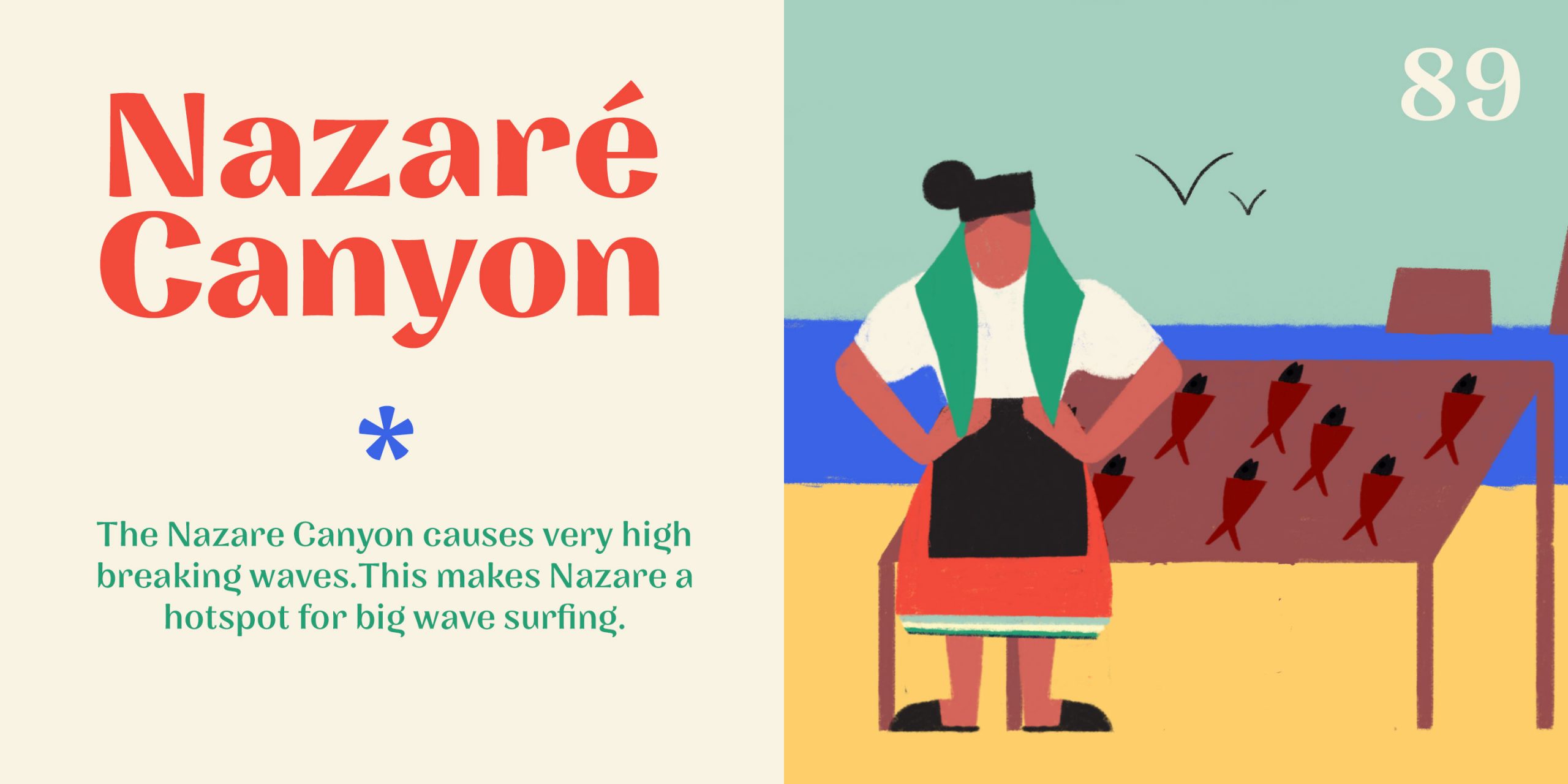
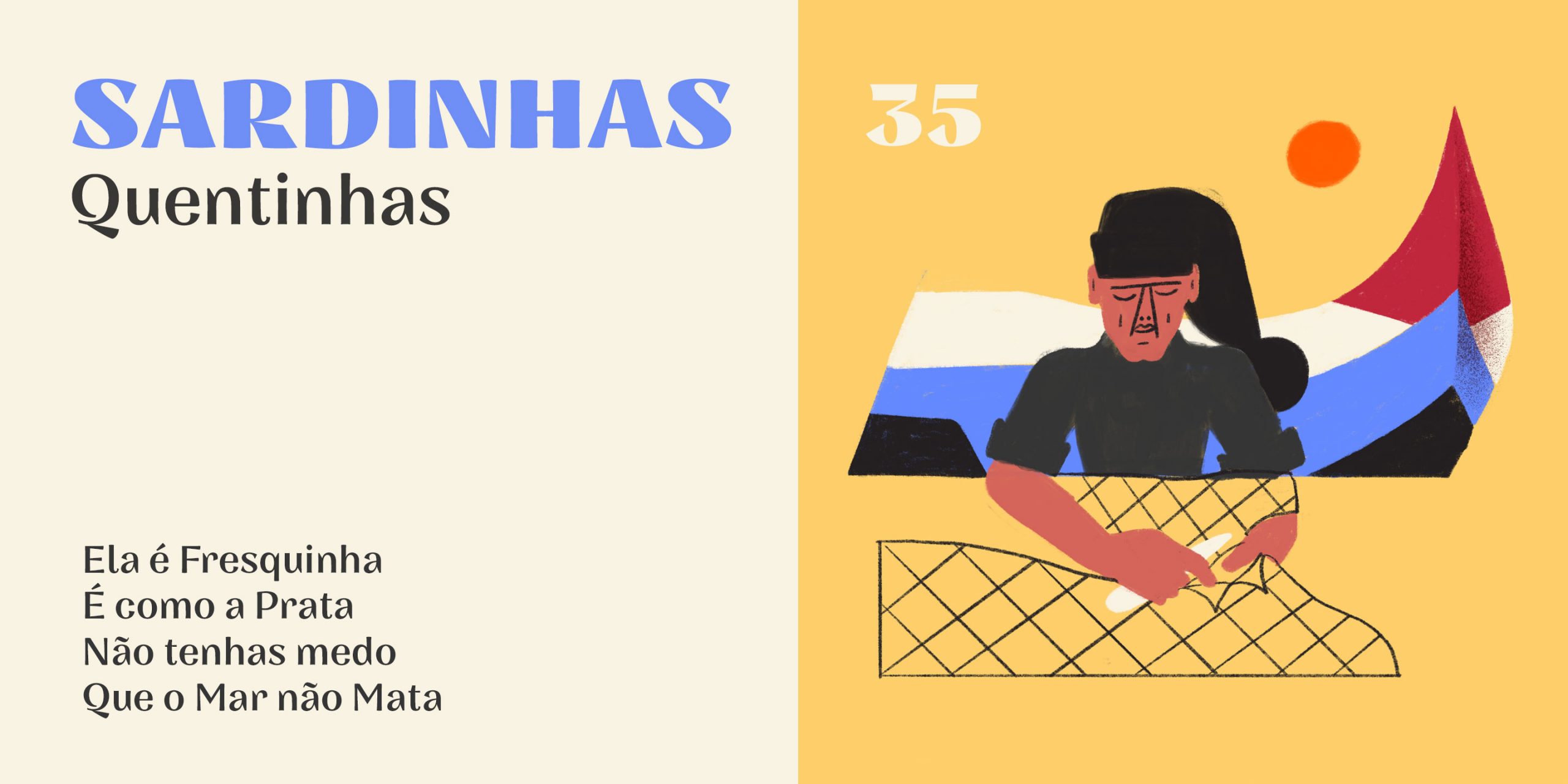
Nazaré is the name of a small Portuguese fishing village known for its giant waves and peculiar people.
Features
6 weights
Old Style Figures
Case Sensitive Forms
Designer
Natanael Gama
Year
2018
Language Support
Western Europe
Central/Eastern Europe,
Baltic